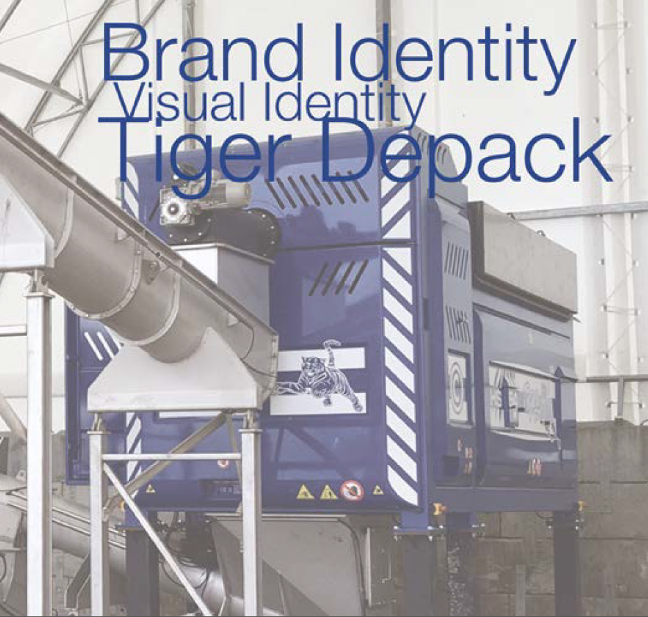
The concept of STRENGTH and TECHNOLOGY expresses both elements intrinsic to the products as well as characteristic features of the brand.
A "swipe" towards the future of the Tiger Depack Brand
The new Tiger Depack brand is the result of a scrupulous study of the product characteristics and of the company it represents. The main goal we set ourselves is to convey efficiently and immediately the key concepts of the Tiger Depack brand.
A fundamental point represented by our brand, and in all its interpretations, is the concept of STRENGTH and TECHNOLOGY that expresses both elements intrinsic to the products as well as characteristic features of the brand.
Graphically we can consider this to be a restyling of the brand. This development became necessary as the brand matured, owing to the extension of the product lines and the international scope of the company.
We started with a symbol that embodies the concept of strength, albeit in its simplicity: a tiger's claw.
This symbol represents - in both its shape and in its meaning - a set of different elements that in their immediate meaning manage to portray the concepts that the brand wishes to convey.
From this symbol we created a graphic iconic image that aims at representing several abstract concepts:
-
The graphic element consists of 4 irregular signs, in parallel and of different lengths.
-
The 4 signs slant from left to right. This image represents the scratch mark left by a swipe made by a tiger's paw.
-
The graphic element represents the effect of the "swipe" and not the swipe itself. It is a way to emphasise the importance of the result.
-
The choice of a scratch has another meaning in the type of work that Tiger Depack machines carry out, as they rip up packaging.
On the whole the logo consists of 3 distinct elements that constitute it:
-
The Iconic element (Pictogram) representing a tiger's paw scratch
-
The Logotype (graphic element) which is the name of the brand
-
The below the line
These 3 elements, whether in the vertical development version or in the extended version, are perfectly balanced with one another and each one specifies the preceding element.
In addition to classic coordinated communication (headed paper, envelopes, business cards, etc.), we also devised further usage possibilities. In all its manifestations, the brand proves to have a strong cost effectiveness since it is monochrome, a characteristic that encourages possible printing on hard copy media, fabrics, etc. Indeed, it retains superior efficiency of readability and functionality on all media and in all sizes.
The modernity of this brand means it can be used as the genuine Brand for technical merchandising.
Also in advertising posters, web pages and billboards, it remains readable and efficient in any size. .


